Working with charts
python-pptx supports adding charts and modifying existing ones. Most chart types other than 3D types are supported.
Adding a chart
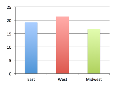
The following code adds a single-series column chart in a new presentation:
from pptx import Presentation
from pptx.chart.data import CategoryChartData
from pptx.enum.chart import XL_CHART_TYPE
from pptx.util import Inches

# create presentation with 1 slide ------
prs = Presentation()
slide = prs.slides.add_slide(prs.slide_layouts[5])

# define chart data ---------------------
chart_data = CategoryChartData()
chart_data.categories = ['East', 'West', 'Midwest']
chart_data.add_series('Series 1', (19.2, 21.4, 16.7))

# add chart to slide --------------------
x, y, cx, cy = Inches(2), Inches(2), Inches(6), Inches(4.5)
slide.shapes.add_chart(
    XL_CHART_TYPE.COLUMN_CLUSTERED, x, y, cx, cy, chart_data
)

prs.save('chart-01.pptx')
Customizing things a bit
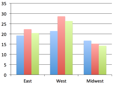
The remaining code will leave out code we’ve already seen and only show imports, for example, when they’re used for the first time, just to keep the focus on the new bits. Let’s create a multi-series chart to use for these examples:
chart_data = ChartData()
chart_data.categories = ['East', 'West', 'Midwest']
chart_data.add_series('Q1 Sales', (19.2, 21.4, 16.7))
chart_data.add_series('Q2 Sales', (22.3, 28.6, 15.2))
chart_data.add_series('Q3 Sales', (20.4, 26.3, 14.2))

graphic_frame = slide.shapes.add_chart(
    XL_CHART_TYPE.COLUMN_CLUSTERED, x, y, cx, cy, chart_data
)

chart = graphic_frame.chart
Notice that we captured the shape reference returned by the
add_chart() call as graphic_frame and then extracted
the chart object from the graphic frame using its
chart property. We’ll need the chart reference to get
to the properties we’ll need in the next steps. The
add_chart() method doesn’t directly return the chart
object. That’s because a chart is not itself a shape. Rather it’s a graphical
(DrawingML) object contained in the graphic frame shape. Tables work this
way too, also being contained in a graphic frame shape.
XY and Bubble charts
The charts so far use a discrete set of values for the independent variable (the X axis, roughly speaking). These are perfect when your values fall into a well-defined set of categories. However, there are many cases, particularly in science and engineering, where the independent variable is a continuous value, such as temperature or frequency. These are supported in PowerPoint by XY (aka. scatter) charts. A bubble chart is essentially an XY chart where the marker size is used to reflect an additional value, effectively adding a third dimension to the chart.
Because the independent variable is continuous, in general, the series do not
all share the same X values. This requires a somewhat different data
structure and that is provided for by distinct XyChartData and
BubbleChartData objects used to specify the data behind charts of these
types:
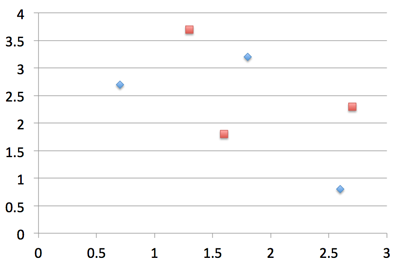
chart_data = XyChartData()

series_1 = chart_data.add_series('Model 1')
series_1.add_data_point(0.7, 2.7)
series_1.add_data_point(1.8, 3.2)
series_1.add_data_point(2.6, 0.8)

series_2 = chart_data.add_series('Model 2')
series_2.add_data_point(1.3, 3.7)
series_2.add_data_point(2.7, 2.3)
series_2.add_data_point(1.6, 1.8)

chart = slide.shapes.add_chart(
    XL_CHART_TYPE.XY_SCATTER, x, y, cx, cy, chart_data
).chart
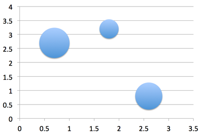
Creation of a bubble chart is very similar, having an additional value for each data point that specifies the bubble size:
chart_data = BubbleChartData()

series_1 = chart_data.add_series('Series 1')
series_1.add_data_point(0.7, 2.7, 10)
series_1.add_data_point(1.8, 3.2, 4)
series_1.add_data_point(2.6, 0.8, 8)

chart = slide.shapes.add_chart(
    XL_CHART_TYPE.BUBBLE, x, y, cx, cy, chart_data
).chart
Axes
Let’s change up the category and value axes a bit:
from pptx.enum.chart import XL_TICK_MARK
from pptx.util import Pt

category_axis = chart.category_axis
category_axis.has_major_gridlines = True
category_axis.minor_tick_mark = XL_TICK_MARK.OUTSIDE
category_axis.tick_labels.font.italic = True
category_axis.tick_labels.font.size = Pt(24)

value_axis = chart.value_axis
value_axis.maximum_scale = 50.0
value_axis.minor_tick_mark = XL_TICK_MARK.OUTSIDE
value_axis.has_minor_gridlines = True

tick_labels = value_axis.tick_labels
tick_labels.number_format = '0"%"'
tick_labels.font.bold = True
tick_labels.font.size = Pt(14)
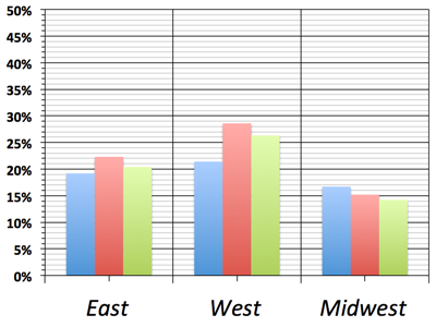
Okay, that was probably going a bit too far. But it gives us an idea of the kinds of things we can do with the value and category axes. Let’s undo this part and go back to the version we had before.
Data Labels
Let’s add some data labels so we can see exactly what the value for each bar is:
from pptx.dml.color import RGBColor
from pptx.enum.chart import XL_LABEL_POSITION

plot = chart.plots[0]
plot.has_data_labels = True
data_labels = plot.data_labels

data_labels.font.size = Pt(13)
data_labels.font.color.rgb = RGBColor(0x0A, 0x42, 0x80)
data_labels.position = XL_LABEL_POSITION.INSIDE_END
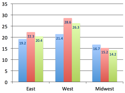
Here we needed to access a Plot object to gain access to the data labels. A plot is like a sub-chart, containing one or more series and drawn as a particular chart type, like column or line. This distinction is needed for charts that combine more than one type, like a line chart appearing on top of a column chart. A chart like this would have two plot objects, one for the series appearing as columns and the other for the lines. Most charts only have a single plot and python-pptx doesn’t yet support creating multi-plot charts, but you can access multiple plots on a chart that already has them.
In the Microsoft API, the name ChartGroup is used for this object. I found that term confusing for a long time while I was learning about MS Office charts so I chose the name Plot for that object in python-pptx.
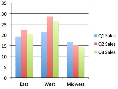
Legend
A legend is often useful to have on a chart, to give a name to each series and help a reader tell which one is which:
from pptx.enum.chart import XL_LEGEND_POSITION

chart.has_legend = True
chart.legend.position = XL_LEGEND_POSITION.RIGHT
chart.legend.include_in_layout = False
Nice! Okay, let’s try some other chart types.
Line Chart
A line chart is added pretty much the same way as a bar or column chart, the
main difference being the chart type provided in the add_chart() call:
chart_data = ChartData()
chart_data.categories = ['Q1 Sales', 'Q2 Sales', 'Q3 Sales']
chart_data.add_series('West',    (32.2, 28.4, 34.7))
chart_data.add_series('East',    (24.3, 30.6, 20.2))
chart_data.add_series('Midwest', (20.4, 18.3, 26.2))

x, y, cx, cy = Inches(2), Inches(2), Inches(6), Inches(4.5)
chart = slide.shapes.add_chart(
    XL_CHART_TYPE.LINE, x, y, cx, cy, chart_data
).chart

chart.has_legend = True
chart.legend.include_in_layout = False
chart.series[0].smooth = True
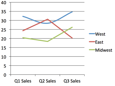
I switched the categories and series data here to better suit a line chart. You can see the line for the “West” region is smoothed into a curve while the other two have their points connected with straight line segments.
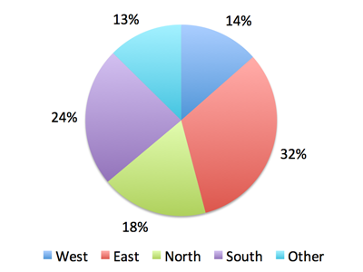
Pie Chart
A pie chart is a little special in that it only ever has a single series and doesn’t have any axes:
chart_data = ChartData()
chart_data.categories = ['West', 'East', 'North', 'South', 'Other']
chart_data.add_series('Series 1', (0.135, 0.324, 0.180, 0.235, 0.126))

chart = slide.shapes.add_chart(
    XL_CHART_TYPE.PIE, x, y, cx, cy, chart_data
).chart

chart.has_legend = True
chart.legend.position = XL_LEGEND_POSITION.BOTTOM
chart.legend.include_in_layout = False

chart.plots[0].has_data_labels = True
data_labels = chart.plots[0].data_labels
data_labels.number_format = '0%'
data_labels.position = XL_LABEL_POSITION.OUTSIDE_END
Odds & Ends
This should be enough to get you started with adding charts to your presentation with python-pptx. There are more details in the API documentation for charts here: Charts
About colors
By default, the colors assigned to each series in a chart are the theme colors Accent 1 through Accent 6, in that order. If you have more than six series, darker and lighter versions of those same colors are used. While it’s possible to assign specific colors to data points (bar, line, pie segment, etc.) for at least some chart types, the best strategy to start with is changing the theme colors in your starting “template” presentation.